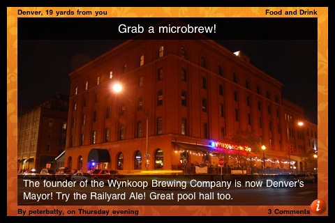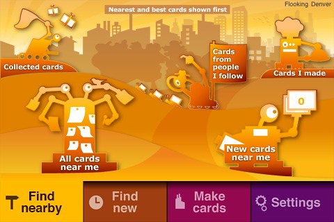
The application is well designed, and has a fun and quirky feel to it. The following screenshot is an example - the oddball robots feature throughout the app.

As flook starts up it gives you strange messages like "flook is snurging its capitulators" and "flook is polishing its locbots" (though I haven't seen that one much recently, so I guess my locbots must be pretty shiny!). Those still make me smile, though maybe the novelty will wear off at some point :).
So anyway, there's nothing very complex about the functionality, but that's part of the appeal too. It's simple but fun to use.
I think that two of the main challenges that the flook folks face are first, getting enough content in there to make it more interesting (it has just been released and I am the first user in Denver, so there is limited appeal to me in just browsing through my own cards, cool though they are ;)!). I have put in a couple of feature requests in regard to content creation, including the ability to more easily take my existing pictures from flickr and create cards from those (especially from photos which are already geotagged). The second big challenge, once they have a good volume of cards in the system, will be how to filter them effectively, to show you ones that are interesting to you.
There are a few things missing at the moment which I imagine will be addressed soon. One is the ability to find friends who are using flook, via the usual assortment of mechanisms like searching your contacts or Facebook friends. You can tweet from flook but I'd like a bit more control over how that works - currently there's just a global toggle which will cause a tweet to be sent whenever you create a new card (or not). I'd like a third option which would prompt you whether you want to tweet or not for each card, and give you the ability to edit the tweet message (currently it shows the title and caption from the card, with a link, which is a good starting point but depending on the situation I might like to tweet something a little different). The tweets are geo-located too, using the new geo feature of the Twitter API, which is cool. Flook has a scoring system, but at the moment there's no way to see how you rank, and nothing that I can see at the moment that promises to have that somewhat-silly-but-somehow-addictive quality of foursquare's mayor system.
The team behind flook has a strong pedigree from Psion / Symbian and they are well funded, so I think that while flook is clearly still in very early days, it will be an application to keep an eye on. If you have an iPhone, I recommend that you give it a try, it's fun!
![Reblog this post [with Zemanta]](http://img.zemanta.com/reblog_e.png?x-id=29cfd27a-afc2-45db-8ea9-bcfee9b03466)
2 comments:
Jane from Ambient Industries here. Thanks for the thoughful review, Peter. You'll be glad to know that we plan to show you your world ranking on the phone very soon (as well as on the web as we do now). We'll also be ranking people over smaller geographical areas, and over shorter time periods as well, which we hope will give people more ways to compete to make great cards.
Give us a shout in London - I'd love to share some of our product plans and get your feedback.
Hi Jane, thanks! I had missed the scoring on the main web site, thanks for pointing that out. And I agree that some system of ranking people over shorter time periods and within regions is a good idea. I'd enjoy catching up with you guys when I'm in the UK if we can coordinate schedules - I'll drop you a line.
Post a Comment