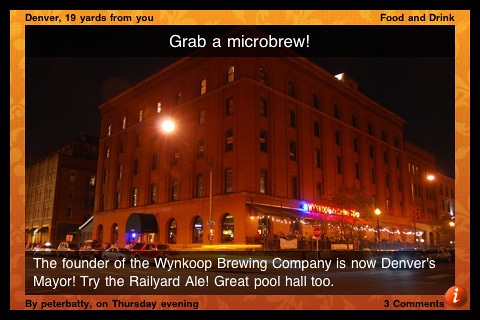
The past few days I have been playing around with flook, a new "location browser" application for the iPhone, and I like it. You can access some aspects of it in a regular browser, but it's really focused around the iPhone application. The basic idea is that users create "cards" with a photo, title and brief caption, together with a location, and you can browse for cards that are close to you. The user interface is very simple - you just swipe to go from one card to the next. The following is an example of one of my cards, featuring my local brewpub (which I live above):
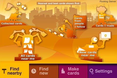
The application is well designed, and has a fun and quirky feel to it. The following screenshot is an example - the oddball robots feature throughout the app.
As flook starts up it gives you strange messages like "flook is snurging its capitulators" and "flook is polishing its locbots" (though I haven't seen that one much recently, so I guess my locbots must be pretty shiny!). Those still make me smile, though maybe the novelty will wear off at some point :).
So anyway, there's nothing very complex about the functionality, but that's part of the appeal too. It's simple but fun to use.
I think that two of the main challenges that the flook folks face are first, getting enough content in there to make it more interesting (it has just been released and I am the first user in Denver, so there is limited appeal to me in just browsing through my own cards, cool though they are ;)!). I have put in a couple of feature requests in regard to content creation, including the ability to more easily take my existing pictures from flickr and create cards from those (especially from photos which are already geotagged). The second big challenge, once they have a good volume of cards in the system, will be how to filter them effectively, to show you ones that are interesting to you.
There are a few things missing at the moment which I imagine will be addressed soon. One is the ability to find friends who are using flook, via the usual assortment of mechanisms like searching your contacts or Facebook friends. You can tweet from flook but I'd like a bit more control over how that works - currently there's just a global toggle which will cause a tweet to be sent whenever you create a new card (or not). I'd like a third option which would prompt you whether you want to tweet or not for each card, and give you the ability to edit the tweet message (currently it shows the title and caption from the card, with a link, which is a good starting point but depending on the situation I might like to tweet something a little different). The tweets are geo-located too, using the new geo feature of the Twitter API, which is cool. Flook has a scoring system, but at the moment there's no way to see how you rank, and nothing that I can see at the moment that promises to have that somewhat-silly-but-somehow-addictive quality of foursquare's mayor system.
The team behind flook has a strong pedigree from Psion / Symbian and they are well funded, so I think that while flook is clearly still in very early days, it will be an application to keep an eye on. If you have an iPhone, I recommend that you give it a try, it's fun!
So as I talked about in my previous post, Ordnance Survey is going to make its small scale data freely available. I think that in many ways, OpenStreetMap has been a major influence in making this happen. The growth of OpenStreetMap has increased the awareness of the benefits of free geospatial data, and it was becoming apparent that there would no longer be a significant market for the Ordnance Survey to sell small scale map data, certainly not at the sort of high prices it has traditionally charged.
However, the fact that this is happening raises some major questions about the future of OpenStreetMap in the UK, and could even lead to its demise there. At the very least, it dramatically changes the nature of OpenStreetMap in the UK. People have different motivations for contributing to OpenStreetMap. Some do it just because they think it's fun, and they like mapping their local area. For many people there is motivation around the fact that they believe it's important to have freely available and open map data. Suddenly at a stroke, the second motivation is seriously diminished (in the UK), as this aim has been achieved if the Ordnance Survey makes a high quality and very complete dataset freely available. Now we don't know for sure yet what Ordnance Survey will release - it is possible that it could just make raster map data available (like Google does). But it seems likely to me that they will probably make the small scale vector data available too - there is certainly lots of demand for this.
We also don't know the licensing terms yet, but it seems likely that the Ordnance Survey data will be in the public domain. So ironically it will be more open than OpenStreetMap, whose current and new licenses are fairly "viral" - roughly speaking they say that if you enhance the data, you have to make those enhancements available on the same terms as the original data (i.e. the enhanced data has to be freely available). This more or less precludes having a commercial ecosystem of "value added" data providers on top of OpenStreetMap. And many commercial companies, like Google, have expressed concern about using OpenStreetMap because of licensing (even with the new license that should be rolled out soon). But potentially Google, Microsoft et al will be free to use the Ordnance Survey data with no constraints.
So where does this leave OpenStreetMap in the UK? It is interesting to compare the situation in the UK with the US. OpenStreetMap took off very quickly in the UK, driven in many ways by frustration with the Ordnance Survey and the lack of free map data. In the US it has taken off more slowly, and this is widely thought to be because there are more sources of free map data (albeit often poor quality ones, as I've discussed previously). There has also been a lot of spirited discussion recently on the OpenStreetMap mailing lists about the pros and cons of importing TIGER data as a starting point in the US. There is a strong contingent that argues that cleaning up existing data is less interesting and motivating than mapping something from scratch, and that this is why there is less interest in OpenStreetMap in the US than the UK. The counter-argument, which I support in general, is that we are much further along in the US with TIGER data than we would have been without it. But anyway, suddenly the UK finds itself in a similar situation to the US, but with a much higher quality free data source (assuming there are no licensing issues, which there won't be if the data is public domain, which is what I expect).
This raises a lot of practical issues in terms of data imports, which we have already faced (but not solved) with OpenStreetMap in the US. OpenStreetMap in the UK has a rich database already - according to Muki Haklay, it is about 65% complete in terms of geometry, and 25% complete if you consider attributes. Now you have a 100% complete high quality dataset that you could import, but how do you reconcile this with existing data? This is a complex problem to solve. And how about subsequent updates? Do you just do a one time import of OS data, and let the community do updates after that? Will people be motivated to do this, if the OS is updating its own dataset for free in parallel? Is there some way of using the OS data for items that they maintain, and having OpenStreetMap focus on more detailed items (benches, trash cans / bins, etc)?
The ideal world might be to have some sort of integration between OpenStreetMap and the Ordnance Survey. I have spoken often about the disruptive impact of crowdsourcing and how government agencies and commercial companies need to leverage the power of this approach to bring down the cost of creating and maintaining data. Now that Ordnance Survey will have reduced revenues and require increased subsidies from taxpayers, they will be under increasing pressure to cut costs. If there was a way to leverage the power of the thriving OpenStreetMap community in the UK that could reduce costs quite significantly. There are challenges with doing this and it may just be wishful thinking ... but we can hope :).
So anyway, this move raises lots of questions about what OpenStreetMap will look like in the UK in future. If you regarded the mission of OpenStreetMap in the UK as being to create a free, open and high quality map of the UK, you can argue that the mission is completed (or will be in April), perhaps in a slightly unexpected and sudden fashion, like the falling of the Berlin Wall. Steve Coast quotes Gandhi on the OpenGeoData blog: "First they ignore you, then they laugh at you, then they fight you, then you win." The question is should we add "... and then you die"? (Or less drastically perhaps, retire, or have no reason to exist any more?)
There are some other aspects to OpenStreetMap of course, like I alluded to before - making more detailed maps of aspects of your neighborhood than the Ordnance Survey does for example. But working out how those other aspects can coexist alongside the new reality of free OS data is complex. And how many OpenStreetMappers will lose the incentive to participate in this new world, if there is an alternative source of good quality, free and open data? We live in interesting times in the geo world today - this is the second hugely disruptive announcement (following the Google earthquake) in a month or so!
I should just reiterate that of course all these specific questions apply to OpenStreetMap in the UK, they don't affect its aims and benefits in the rest of the world - except that a lot of energy for the global movement has come from the UK, so if that energy diminishes it could have some knock-on effect in the rest of the world. But I hope not!
This move by Ordnance Survey will also increase pressure on National Mapping Agencies in other countries to make more data freely available (where it isn't already).
So yesterday the UK government announced that some data sets (not all) from the Ordnance Survey (the UK national mapping agency) will be made available for free - 1:10,000 scale data and above is included (so this includes popular OS maps like the 1:25,000 and 1:50,000, in digital form). The more detailed maps (1:1250 and 1:2500) are not included - but I believe that issues related to derived data will also be resolved, which will be useful in regard to those datasets too. Overall I think this is the right decision, in what is a much more complex issue than most people realize, as I discussed briefly in my recent georant on the topic. This approach makes available most of the data that is useful to the broader world, while minimizing the impact to Ordnance Survey's revenue, most of which comes from the large scale 1:2500 and 1:1250 map data (known as MasterMap). I was recently asked for my opinions by some consultants working for the UK government on the Ordnance Survey strategy, and this is the option I favored.
As I pointed out in my georant, making all Ordnance Survey data free would cost the UK taxpayer an extra 50 million pounds a year (a total of 100 million pounds a year). This approach should cost the taxpayer substantially less - though there will still be a cost, in the order of a few tens of millions a year. Nobody has said where spending will be cut to pay for this - but I personally think it will be money well spent in this scenario (Update: I have heard other estimates that the lost revenue due to sales may be more in the £5-10m range, but nobody seems to have a firm estimate yet - well nobody knows which products are involved so that makes it harder. My number was just an order of magnitude guess).
The Guardian, though my favorite newspaper, continues to make several incorrect statements in support of this move. They say "the move will bring the UK into line with the free publication of maps that exists in the US". What maps are they talking about? Again as I talked about in my georant, there are two main sources of central government maps in the US, the USGS "national map" and the US Census Bureau TIGER data. Both of these have very limited funding (as they are paid for by the taxpayer and deemed low priority compared to other things), and their map products are not good enough quality to be used as base maps by local government or infrastructure companies like gas, electric and telecoms. As a result, all of these companies and agencies do their own base mapping, leading to huge inefficiencies with all cities being mapped multiple times in inconsistent fashion, so data from the electric utility often doesn't line up at all with data from the gas utility, for example. More detailed map data created by local government agencies (like parcel maps) has a huge array of different policies - some give it away free, some free for non-commercial use only, and some charge significant amounts for it. So please don't hold up the US as an example of what you want in a national mapping infrastructure, it's a real mess here I'm afraid! I really hope that the UK government will step up to the increased taxpayer funding that Ordnance Survey now needs to continue its work as one of the premier National Mapping Agencies in the world, and that funding for mapping won't be cut drastically as it has been in the US (where for example, USGS has gone from having ~2500 people working on the national map in the 1980s to two hundred and something today).
The other thing that annoys me is that the Guardian cites the so-called "Cambridge Report" (PDF), which in my opinion is a very questionable document anyway, in a totally incorrect way. They say that the report says "making all OS data free would cost the government £12m and bring a net gain of £156m". Firstly, that quote alone is very misleading, which is just one of the problems I have with the Cambridge Report, but I won't get into that here (but may return to it in a future post). However, the scenario studied in the Cambridge report was not "making all OS data free", it studied the option of giving away all the large scale data for free, and not giving away the small scale data - in other words the EXACT OPPOSITE of what is being proposed. So the specifics of the Cambridge Report in regard to the Ordnance Survey have ZERO RELEVANCE to the decision which has been announced (except to reinforce that there is some benefit to society in making free map data available, which is stating the obvious anyway). I am in favor of the decision as I said, but like to think of myself as a scientist and a scholar :), and it really annoys me when people blatantly misrepresent evidence to make their case.
So anyway, don't get me wrong - I think that this is a very good thing for the UK geospatial industry, and for the general principle of open data, which I am a strong supporter of, despite that fact that I will also point out the challenges with it when appropriate! I think that the right broad option has been chosen out of a complex array of possible choices. But there are risks with the decision too, including the potential for reduced funding and deterioration in quality of Ordnance Survey Maps. And there are likely be some big losers too - including NAVTEQ and Tele Atlas (again), and in many ways OpenStreetMap, which is the topic of my next post.
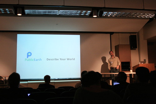
Boulder-based startup PublicEarth, a free wiki for places, has gone live today. I've been on their Advisory Board since they started last year, so am excited to see them launch - congratulations to founder Duncan McCall (pictured below talking at WhereCamp5280), Chairman David Hose, and the rest of the team.
Duncan talks about his original vision for PublicEarth here:
So the idea for a wiki of ‘interesting’ or ‘long tail’ places was born, with ability for users to create, edit and share information in an structured, categorized and intelligent format – with the simple ability to get this information onto mobile and GPS devices.
I see PublicEarth being complementary to OpenStreetMap, which is of course another well known crowdsourced effort around geospatial data. OpenStreetMap is primarily focused on creating a free and open basemap for the world, with some basic points of interest. PublicEarth is not about the basemap, but about creating richer information about interesting places. For example, there's a lot of good information about Public Art in there - I just found out that the big Blue Bear sculpture in Denver was created by a fellow Brit, which I hadn't known before! That data came from Public Art Review - one of the things that PublicEarth has done, and is looking to do more, is to help a variety of organizations who have interesting datasets (like this one about contemporary public art) and make them more accessible, in a way in which they can be easily queried by location. There are all kinds of other interesting datasets in there, with more to come. And of course the whole idea of a wiki or crowdsourced approach is that anyone can create or update information, so I encourage you to give it a try and create some interesting places of your own!
I recently came across a nice flickr search tool called ViewFinder (for Mac), which makes it very easy to search flickr for photos with appropriate Creative Commons licenses, and then download a suitably sized version and insert it into a Keynote presentation. There's a way to copy attribution information too, though that's not done automatically with the "insert Keynote slide" function - hopefully they will provide an option to do that in a future update. But even as it is, it will save me a lot of time putting together presentations with lots of photos.
So if you're into Presentation Zen style and use a Mac, I recommend you check it out. And if you're not into Presentation Zen, you should be - read this :) ...
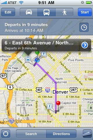
I have been meaning to blog for some time about how useful I find the transit information in Google Maps on the iPhone. It's been around for a while, but I have been using it quite a lot recently and haven't blogged about it before. For those who haven't used it, when you calculate directions you can pick one of three options: driving, public transit, or walking (you also have the same options on Google Maps online). When you choose public transit, it shows you the next available trip, as follows:
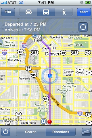
You can click on the clock icon to see later trips and alternative options. This is one example where the application knowing your current location really adds to the convenience of getting the information - you just choose where you want to go, from a search or your contacts, and then the default is to show you how to get there from your current location. Even if you know the route, being able to easily find the time of the next bus is a great convenience. Another nice aspect is that the GPS tracks the bus location as you travel, and shows the scheduled arrival time, making it easy to figure out where to get off, which is another potential source of stress when you're traveling on a route you don't know.
I think that one of the main inhibitors to people using public transit when they're not used to doing it is just the effort of figuring out their options. In a lot of US cities like Denver the culture really isn't to use transit - the default option is just to take the car. We've had some new light rail lines opening over the past few years, with more being built, and a few more people use those, but very few people I know really think about using the bus here. But we actually have a very good bus system, even though many people don't realize it. I am fortunate to live downtown so most of the time I just walk when we go out in the evening, but increasingly if we go further afield I try to take the bus or the light rail, and a strong contributing factor to that is the convenience of figuring out the transit routes (which are often ones I haven't taken before, or at least don't take regularly) on the iPhone.
This is also available in Google Maps Mobile on other platforms apart from the iPhone. But it's only available for some cities - it depends whether the transit agency has made their data available to Google. So it works for example in Denver, and even in Cropston, the small village in Leicestershire in the UK where I grew up, but not (at the moment) in London or Washington DC.
Anyway, I think that mobile multi-modal transit routing applications like iPhone maps and others have great potential to encourage people to use public transit more. I encourage you to try it, and leave the car at home! Other iPhone applications that can supplement this include things like Taxi Magic, which lets you call a taxi to your current location, and car sharing schemes like zipcar, which now has a cool iPhone app (of which one of the niftiest features is that you can use your iPhone to unlock the car, or even honk its horn to help you find it!).
By the way, I only found out fairly recently how to capture iPhone screen shots - in case you don't know, to do this you hold down the "Home" button and at the same time press and release the power button, and this will save an image of the current screen in your Camera Roll photos. I found this out from the 9 year old son of Dale Lutz!
So the discussions about the great Google map data change in the US rage on, and we are seeing more and more reports of significant data quality issues. I wrote about how Central City Parkway was completely missing, and I reported this to Google to see how the change process would work. I posted later about how it had been partially fixed, with a new geometry visible but not routable, and with the wrong road name and classification. The latest state (on November 5, after reporting the error on October 9), is that is now routable, but it still has the wrong road classification, being shown as a minor road rather than a major highway. This means that if you calculate the best route from Denver to Central City, Google gets it wrong and doesn't go on Central City Parkway, choosing some much smaller mountain roads instead, which take a lot longer. Microsoft Bing, Yahoo, MapQuest and CloudMade (using OpenStreetMap) all calculate the correct route using Central City Parkway. Another substantial error I found recently is that if you search for one of the companies I work for, Enspiria Solutions (by name or address), the location returned was about a mile off. This has now been partially but not entirely fixed (after I reported it).
Steve Citron-Pousty recently wrote about whether Google made the data change too soon. He talked about how his wife has always used Google Maps, but it has got her lost four times in the past week and she has now switched to using MapQuest or Bing. And Google got Steve lost in the Bay Area last week too. Maitri says she is "splitting up with Google Maps" over issues in Ohio, as "there is no excuse for such shoddy mapping when MapQuest and Yahoo do exceptional work in this area the first time around". She links to an article in a Canton, Ohio, newspaper about how the town was mis-named after the recent data change (we call it Canton, Google calls it Colesville). James Fee pointed out an error with Google showing a lake that hadn't been there for 25 years or so. Matt Ball did a round-up discussion on the importance of trusted data. The well known tech journalist Walt Mossberg reviews the new Motorola Droid phone (which uses the new Google data for navigation), and in passing says when reviewing the navigation application "but it also gave me a couple of bad directions, such as sending me the wrong way at a fork in the road". And then in news which is presumably unrelated technically (being the in the UK), there was a lot of coverage of a story about how Google Maps contained a completely fictitious town called Argleton - which even though a separate issue does not help the public perception of the reliability of Google Maps data.
Update: see quite a few more stories about data issues in the comments below.
So anyway, this is a long and maybe somewhat boring list, but I think that it is worth getting a feel for the number of stories that are appearing about map data errors. As anyone in the geo world knows, all maps have errors, and it's hard to do a really rigorous analysis on Google's current dataset versus others. But I think there is strong evidence that the new Google dataset in the US is a significant step down in quality from what they had before, and from what Microsoft, Yahoo and MapQuest have (via Tele Atlas or NAVTEQ).
Google clearly hopes to clean up the data fairly quickly by having users notify them of errors. But looking at the situation, I think that they may have a few challenges with this. One is just that the number of errors seems to be pretty large. But more importantly, I think the question for Google is whether consumers will be motivated to help them fix up the data, when there are plenty of good free alternatives available. If Google gives you the wrong answer once maybe you let it slide, and perhaps you notice the link to inform them of the problem and maybe fill it out. But if it happens a couple of times, is the average consumer likely to keep informing Google of errors, or just say "*&#% this, I'm switching to MapQuest/Bing/Yahoo"?
Google has made some reasonable progress with Google MapMaker (its crowdsourced system for letting people create their own map data) in certain parts of the world, but these are generally places where there are not good alternative maps already, or people may be unaware of alternatives like OpenStreetMap. So in those cases, people have a clearer motivation to contribute their time to making updates. People who contribute time to OpenStreetMap have a range of motivations, but in general for most of them it is important that the data is open and freely available, which is not the case with Google (at least not so much, I won't get into the details of that discussion here). Most if not all the people I know who contribute effort to OpenStreetMap (myself included) would not be inclined to contribute significant updates to Google (except for some experiments to see how good or bad the update process is).
Consumer confidence is a fickle thing, and you probably don't need too many stories in the newspapers of mishaps due to bad data, or more than a couple of direct experiences of getting lost yourself due to bad data, to switch to a different provider (especially when you are choosing between different free systems - you have a bit more incentive to stick with a navigation system and try to make it work if you've spent a few hundred dollars on it).
The risks are even higher with real time turn by turn directions - no matter how many caveats you put on it, you are likely to get some drivers who follow the directions from the system and don't notice relevant road signs. You only need a couple of accidents because people drove the wrong way up one way streets because of bad data to damage consumer confidence even further.
So I think it will be very interesting over the next few months to see whether the data quality issues are bad enough to result in significant numbers of users moving away from Google Maps in the US or not - and whether Google will get significant uptake in terms of number of people contributing error reports in the US (beyond the initial wave of curiosity-driven updates just to test if the process works). Obviously the answer to the second question is likely to have a big influence on the first. Stay tuned ...
Today it was announced that I've joined the new Advisory Board of FortiusOne, together with Jeff Harris, who has a very distinguished background in the Intelligence world, and Michael Frankel and Wolf Ruzicka, who bring great expertise in Business Intelligence and enterprise software. We actually had the first Advisory Board meeting just recently and it's a great group.
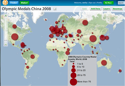
I've followed the development of FortiusOne with interest for a few years now, and I did a bit of consulting for them back in the fairly early days of the company. Their CEO Sean Gorman and CTO Andrew Turner are two of the leading thinkers in the geospatial industry. I am a big proponent of their philosophy of de-mystifying geospatial analysis and making it accessible to a much broader audience of non-specialists. You can check out their free GeoCommons site which lets you easily search for, upload and download geospatial data, and produce great looking maps and spatial analysis like this:
(Click on the map to go to the interactive version)
One cool feature of GeoCommons is the ability to upload spreadsheets containing addresses or place names, which will be automatically geocoded using the free and open source GeoCommons geocoder. There are lots of nice examples of using GeoCommons on the FortiusOne blog, for example these posts on health care, the AfghanElections, and home foreclosures. FortiusOne sells enterprise versions of their application (as a service or an appliance), which have additional analytic capabilities beyond those on the free public site, but with the same focus on simplicity and ease of use. I look forward to working with the team at FortiusOne, and watch for more cool new things coming soon!
I talk at quite a few conferences, as regular readers will know, and have been experimenting with videoing some of my presentations for a little while now. I thought I would share some of my experience on techniques I've tried and how they've worked.
Basic Approaches
Of course a basic option is just to take a single digital video that includes the speaker and/or the slides. Options include setting this up yourself by putting a camera on a small tripod, or even a table, or getting someone else in the audience to do the filming. You can get reasonable results doing this - certainly better than not seeing the presentation at all! A recent example of this approach was my "cowboy georant" at AGI GeoCommunity.
That was just taken on a cheap Flip video camera and it gives a good idea of the presentation - but it misses out quite a bit too. You don't get to see most of the carefully crafted slides :) (though maybe the cowboy hat was more interesting in this case!). One way to enhance a basic video like this is to upload files to SlideShare, and then imbed the video and slides next to each other, like this.
One other scenario where it makes sense to use a simple approach like this is when doing live streaming. Dave Bouwman and Brian Noyle have done a good job in live streaming presentations from various events for geogeektv (some older recordings here). This is very easy to do - all you need is a webcam (an external one is probably most flexible in this scenario), and a free membership of one of various online streaming services like ustream. Most of these services have the ability to both stream live and record for later viewing.
Using ScreenFlow
But with just a little effort you can combine videos of the presenter and the slides so you get a good view of both. The software I use to do this is called ScreenFlow, which runs on Mac only. It can record everything happening on your screen (from basic slides to video and software demos), and also gives you the option to concurrently record video from an internal or external webcam on your computer. ScreenFlow gives you nice capabilities to position the two (or more) video streams within your final output. I have used this on quite a few occasions with my built in webcam and a "picture in picture" style. The following is an example of this:
This approach works pretty well. If you watch for a few minutes you will see that the small window showing me talking can be easily moved around the screen, to avoid overlapping with significant items on a slide. This adds a bit of work to run through the presentation file in ScreenFlow and move the video window as needed depending on the current slide, though it's straightforward to do this. If you designed your slides appropriately with this approach in mind, you could potentially avoid (or at least minimize) the need to move the video window ... though I have to confess I haven't been organized enough to do that yet! But this definitely works well and doesn't need any equipment other than a laptop with a webcam.
A couple of minor drawbacks with this approach include the fact that using the built in webcam gives a slightly odd angle looking up at the presenter, especially if you are tall as I am, and the video window showing the presenter is rather small. I recently bought a new HD video camera (a Lumix GH1), and decided to try a different approach for my recent presentation in Duluth. I set up the video camera on a separate tripod focused on the presentation podium. I could have recorded the slides while I presented (which would have been easiest), but actually I recorded them separately in ScreenFlow after the fact (following along with the video to get the timing right). This is a useful option to have if you don't record the slides at the time for some reason, but you have a video of the presenter.
Having the video of me presenting in a wide screen HD format (1280x720 pixels) gave me the idea of putting the slides and presenter video side by side as in the following (click through to see it in a larger format, including the HD version):
ScreenFlow has this nice ability to rotate the videos in a 3D space, which makes them slightly narrower without losing any content, as well as giving an interesting perspective effect. Putting the slide video on top crops out one side of the presenter video (which is just static background) and the other side is cropped by the edge of the overall frame. Overall I really like this layout - it gives you a clearer view of the presenter, from a better angle than using the webcam, and you can also see the whole of all the slides. One other nice little graphical touch I added is to include a 50% reflection below both videos - another cool feature of ScreenFlow. I can provide more specific details on putting this together if anyone needs that.
Specific tips on using ScreenFlow
Make sure you have plenty of spare disk space - ScreenFlow stores video in high quality for the full screen resolution and the webcam, so a raw file can easily take up a few gigabytes (once you output the final presentation video it will be compressed and a lot smaller). Once I didn't have a lot of spare disk space on my laptop, and got into a long discussion after the presentation without turning recording off, then the disk filled up and I lost the whole recording (enhancement request to the ScreenFlow folks ... it would be great if you could recognize an impending full disk and stop recording cleanly before crashing!)
These days when presenting I usually use "presenter mode" where I can see speaker notes and other information such as elapsed time and the next slide on my laptop screen, while the projector displays just the current slide - both Apple Keynote and Microsoft PowerPoint have this feature. It's especially useful if you're using more of a "presentation zen" style where you have simple pictures on most slides and do away with bullet point lists (which I highly recommend!). Anyway, if you do that you need to make sure that ScreenFlow is recording what is happening on the external display rather than the built in display. It defaults to using the internal display so this is easy to miss, especially in the heat of the moment when you're just about to start presenting. An added complication is that if you don't get to plug in your laptop until immediately before the presentation, you can't select the external display until the last minute (once you are connected to the projector) - which increases the chance of messing up this step. I have done at least a couple of presentations where I accidentally recorded the presenter screen instead of the audience screen. That's not the end of the world as you can re-record the slides after the fact, but that takes extra time of course. So another enhancement request for the ScreenFlow folks is to either default to recording the external screen (or have a preference to specify this), or at least give a warning when starting recording if there are two screens connected.
I have mainly used the internal microphone on my Mac for recording, and that has generally worked pretty well, but on some occasions the sound has been a little quieter than I would like. So it is worth considering an external microphone - one that I have used is the Snowflake, which worked well for my presentation in Perth but unfortunately I left it on the floor afterwards and someone stepped on it :(!
Publishing your video
YouTube has an annoying 10 minute limit which makes it inconvenient for traditional conference presentation formats. I like to use vimeo, which doesn't have this limit and also handles high definition videos nicely (though youtube has upgraded its support in that area recently). Vimeo also gives you the option of letting users download the original video file, if you want to. I now have a geospatial presentation channel on vimeo.
How does this impact conferences?
Kirk Kuykendall commented on my recent video post and wondered how this type of video recording may impact conferences - is there a risk of reducing conference attendance? There might be a slight risk of that, but overall I think it is probably more likely to have the opposite effect and encourage people to attend. A lot of the value of attending conferences is in meeting people, and in the informal (or formal) discussions that happen there. Conferences like Where 2.0 already video their presentations and put them online. TED is another example of a conference that puts all its presentations online, but still charges $4500 for conference attendance and sells out. But hopefully it will help conference organizers focus on providing a good all round experience for attendees.
It also presents a similar dilemma for speakers like myself who talk at a number of conferences. Obviously you sometimes re-use some material, so publishing online increases the risk that some attendees have seen parts of your presentation before. But again I feel the benefits outweigh the risks - you get an additional audience for your presentation, it may encourage some additional people to come and see you speak live, and it also gives you an incentive you to keep refreshing your material!
![Reblog this post [with Zemanta]](http://img.zemanta.com/reblog_e.png?x-id=29cfd27a-afc2-45db-8ea9-bcfee9b03466)
![Reblog this post [with Zemanta]](http://img.zemanta.com/reblog_e.png?x-id=861e9204-636d-4f96-8c55-7acb9aa39156)
![Reblog this post [with Zemanta]](http://img.zemanta.com/reblog_e.png?x-id=e051a486-7bbd-4a3f-b655-83baa89dc55f)