However, yesterday Sean Gorman posted that he had analyzed his data, and the interesting thing is that it wasn't accurate - it showed the general areas he'd been to, but didn't reveal where he lived or where he worked. And then I also found this post by Will Clarke, followed by this one, which also conclude that whatever the data is, it isn't your accurate location (though I think Will prematurely concludes that it is cell tower locations - Sean's analysis suggests that isn't the case, though it seems it may well be related to this).
I just had a good chat on the phone with Pete about these posts, and about my findings which I'll get onto in a moment, which similarly conclude that whatever is being tracked, it isn't your accurate location. Pete said that their conclusions were similar, but also that he didn't think it was simply cell towers. I know that my iPhone knows my location much more accurately than the locations that I see in the data I've looked at. For me, as for Sean, there was no cluster of points either at my home or my office. Pete asked me if I'm on WiFi rather than 3G at home and at work, and the answer is yes, so there may be some clue there.
But the main point of these posts, and mine, is that this data does NOT indicate where you live, where you work or any exact locations you've been to. This is not reflected in most of the reporting you see about the topic.
I thought I'd share some screen shots of maps that I got, which I actually thought were cool :). Since I travel quite a bit, I have a few interesting examples which might give some clues as to what this location data actually does represent. The detailed (larger scale) maps here show a grid of dots, which is something introduced by Pete's map display tool rather than how the underlying data is. I will try to play around a bit more to get at the raw data, but thought I would share these initial findings first.
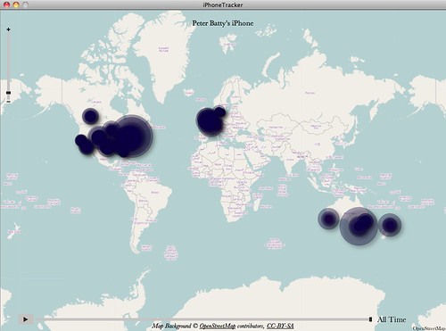
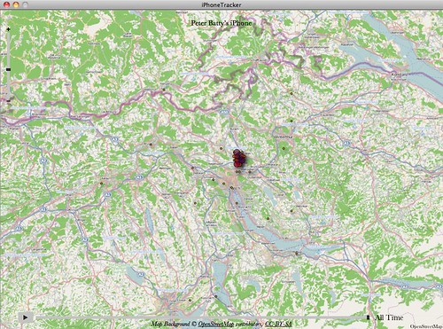
So to start with, here's an overview of my world travels of the past few months, which seems pretty accurate, and goes back to at least September:
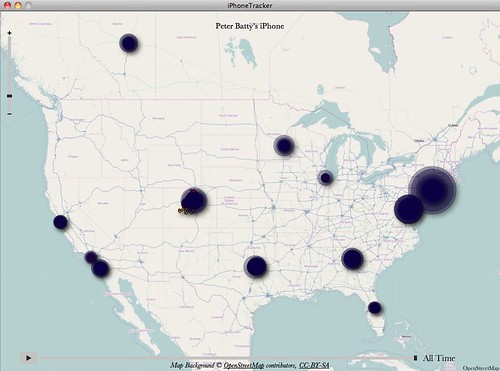
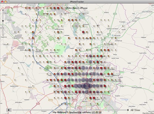
Here's a view zoomed in on the US. The interesting thing here is that New York has the largest bubble over it, but I only spent two days there on a recent trip (1 day in Manhattan, 1 day on Long Island). Denver where I live has a much smaller blob.
Here's a map of Colorado - there seem to be quite a few outliers here on the south side of the map - I think that the closest I've been to these in recent months is Keystone, where you see a cluster of dots. Some of these dots are probably 50 miles away from where I was.
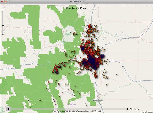
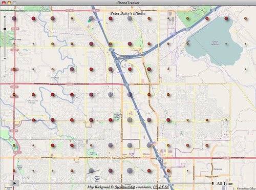
Zooming in on Denver, you see a lot of activity. I'm sure I haven't covered Denver quite as comprehensively as the dots here suggest.
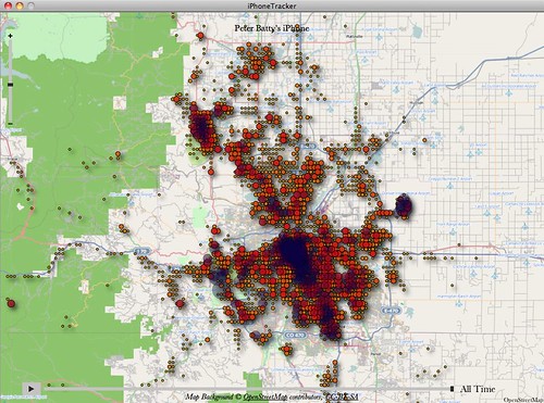
In this map of downtown Denver you see the gridding which somewhat obscures the underlying data. However, the largest dot is some way away from my home (which as I think everyone knows is above the famous Wynkoop Brewing Company), and the dots are fairly evenly spread - these certainly do not indicate where I spend most of my time downtown.

Similarly, my office (where I usually work a couple of days a week, the other days I work at home) does not jump out on this map of the Denver Tech Center (as you can find out from our web site, the Ubisense office is at 5445 DTC Parkway).
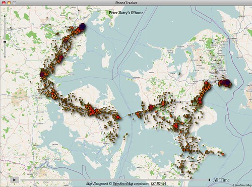
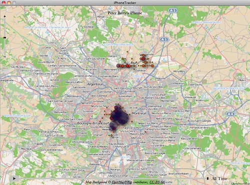
On to my UK travels - I think the data includes two trips there. There seem to be quite a few outliers here also, and some fairly large clusters in places I just passed through on the train. I spent most of my time on these trips at my mother's house in Cropston, just north of Leicester, which isn't reflected in the data. I spent some time in London, but it has a disproportionate representation on the map (as New York did in the US map).

Zooming in to the Leicester area, you can see Cropston just to the north of the city, which is where I spent nearly all my time, and this has no readings. I didn't travel around Leicester nearly as much as the dots would suggest. So this map is very misleading in terms of where I spent my time in this area.
This map of Zurich is interesting: I connected through Zurich airport in November, en route to Denmark. I spent maybe 3 hours in the airport and didn't leave it, but you can see lots of outliers, which are up to about 20 miles away.
Here's a map of my trip to Denmark, where I spent time in Copenhagen, Aarhus and Naestved. The interesting thing on this one is that I just drove straight across the island of Funen (Fyn) in the middle of the map, but you can see quite a scatter of readings on either side of the road, especially to the south on the east side of the island.
Almost at the end ... I included this map of Paris as I thought it was interesting that we traveled from London to Paris and back on the Eurostar train, but no points show up along the route. There's an odd horizontal line of locations to the north of Paris, but nothing apart from that between Paris and London.
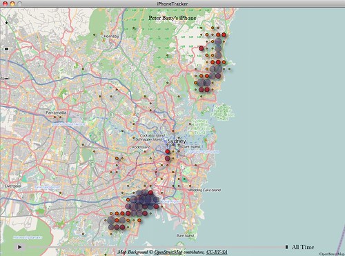
And finally an example from Sydney. This shows a disproportionate number of readings at the airport in the south, where I just arrived and left but didn't spend any time. It doesn't show that I spent a good amount of time downtown, and I gave a talk in Paramatta where there is just one isolated dot. I stayed with friends north of Sydney but again you can't tell where.
While I don't want to be an apologist for Apple, and what they are doing here is careless at best, my general conclusion is that this is likely something unintentional, similar to the Google Street View WiFi data fiasco. If Apple wanted to track your location history, why wouldn't they use your accurate location, which I know my phone knows much more accurately than is shown in the data in these files.
The interesting question for us geo-geeks is exactly what the location data is - something related to cell towers seems plausible. I will try to poke around in the raw data a little more. Since I have a few interesting example cases, am happy to share my data if anyone wants to look at it. Pete just tweeted that there is another table with WiFi locations, that would be an interesting thing to explore.
Update: I've done a new post which includes maps with the raw data, using Google Fusion tables. Doesn't change the conclusion that the data doesn't accurately represent your actual location, but does show some interesting new patterns.
14 comments:
Good analysis Peter - data does not lie.
Very interesting. Cell phone towers are not arranged in a neat symmetrical grid all over the world. So it appears to me that the data is an interpolation of something onto a regular grid. The question is, what is that something?
@Russ sorry if i wasn't clear in my post, but the rectangular grid is due to the way that the visualization tool I was using (Pete Warden's app) aggregates the data - this doesn't represent the actual detailed data. I have managed to extract the underlying data and am looking at it now, so stay tuned.
Great post Peter. As far as the question of why they wouldn't use the GPS location, one hypothesis is that continuous use would drain more power, whereas some variant of tower triangulation could be done using cell signals without any extra hardware being turned on. They are extremely serious about battery-life optimization.
Just an interesting speculation until we hear back from them of course.
Perhaps a count of the number of 'pings' received by towers from your phone. The count would be affected both by the duration of time spent in an area and the number of towers that are in it. This may explain the large bubbles in the densest areas.
Is it possible that atmospheric conditions can allow sporadic pings at great distances? That may explain the outliers.
My guess is that they are "generalizing" the data and using it for iAds. And I don't really care how accurate the data is. As a geonerd, you should know that sometimes, zip code accuracy is enough. Sometimes City-level accuracy is enough. Either way, storing this data like this is a breach of customer trust, and THAT is why people are outraged.
@Pete, I agree they wouldn't want to use GPS unnecessarily, but I use GPS quite a bit for other applications (including Google Latitude) so if they were intentionally trying to record my location history, I would have thought they would log those location events when they happen. But like you say, all speculation for the moment :). As I said above, am playing with the raw data now, which is interesting, will add another post shortly. I am exploring the WifiLocation table you mentioned too, which quite alot larger than the CellLocation table in my case.
One thing you seem to not have noticed is that the columns that identify the cell in the CellLocation table (MCC, MNC, LAC, CI) form a primary key for the table. I.e. each cell (for a network of a carrier) is stored only once. This of course makes it even clearer that it isn't "tracking" you.
@tml good point - as you say this reinforces the fact that the data is a cache of cell tower locations, as I had concluded and as Apple talked about in the referenced document.
You can get uniform grids like that when decimal degrees are cut off at a specific decimal point. So if your actual locations are (-75.12349999, 50.12349999) and (-75.12341111, 50.12341111), but your long/lat is truncated to 4 decimal places, both locations will be mapped at (-75.1234, 50.1234).
@mapper yes, that's essentially what's happening with the map display tool you see here. Look at the blog post I did after this to see the raw data without this aggregation.
@tml: ‘a primary key … of course makes it even clearer that it isn't "tracking" you’
I disagree. The purpose of a primary key is to reference that data in another table. So there *could* be another table or file which records (hashed?) keys and timestamps, tracking you all the time.
The Apple press release vindicates your post. As a Windows 7 user, I cracked my own data myself, and ran it through a few GIS programs, as well as Google Fusion Tables.
It was quickly obvious that the data was not tracking data. For starters, it only had 10 timestamps for 7 months! Also, the locations I most frequent did not show up, even after temporal filtering.
If you get the same experience as I did, you can select each timestamp cluster and see that the points often form a circle. Looks like a buffer select from Apple's database, and the timestamp is the SQL transaction COMMIT (download) time.
So it's just a big media beat-up again, especially when you can just click an iTunes checkbox to 'encrypt backup'
Now the Playstation network getting hacked, that's worth getting excited about. Massive...
@geoist obviously you didn't read to the end and click through to my analysis of the raw data :). This is no more indicative of where you live or work. But if you managed to hack into my computer to obtain this file, you could find that info much more easily by looking at my contacts, calendar or email. There's also more detail about what the cache is doing in my other posts.
Post a Comment